Macbook Pro
Macbook Pro
Designing Clarity in an AI Course Builder
Designing Clarity in an AI Course Builder
Bringing clarity to an evolving AI tool where first-time users struggle to understand what to do next.
Long Story Short
Long Story Short
Gutenberg Technology’s Course Builder AI can turn long documents into courses within seconds, but new users often felt lost when trying it for the first time. They weren’t sure what each step meant or what the system expected them to do next. By using eye-tracking and reviewing their interactions, I was able to see exactly where people hesitated, got confused, or lost confidence. These patterns revealed three core issues: not enough guidance, unclear labels, and limited feedback during important moments. The insights helped the GT team understand the user experience from an outside perspective and shape clearer, more intuitive updates for the beta version.
Gutenberg Technology’s Course Builder AI can turn long documents into courses within seconds, but new users often felt lost when trying it for the first time. They weren’t sure what each step meant or what the system expected them to do next. By using eye-tracking and reviewing their interactions, I was able to see exactly where people hesitated, got confused, or lost confidence. These patterns revealed three core issues: not enough guidance, unclear labels, and limited feedback during important moments. The insights helped the GT team understand the user experience from an outside perspective and shape clearer, more intuitive updates for the beta version.
Duration
Duration
12 weeks
12 weeks
Team
Team
Lan-Ting K
Claire P
Jeffery Y
Aswathi T
Lan-Ting K
Claire P
Jeffery Y
Aswathi T
Client
Client
Gutenberg Technology
Gutenberg Technology
Service
Service
UX Research
Product Design
UX Research
Product Design
Tools
Tools
Figma
Tobii
Hot Jar
Figma
Tobii
Hot Jar
Background
So, what is Course Builder AI?
So, what is Course Builder AI?
Gutenberg Technology's Course Builder AI is a tool within their Content Management System (CMS) platform. It helps users turn massive documents into structured courses in seconds, making it easy to use them directly within the system.
Here’s how it works
Gutenberg Technology's Course Builder AI is a tool within their Content Management System (CMS) platform. It helps users turn massive documents into structured courses in seconds, making it easy to use them directly within the system.
Here’s how it works
*Note: this is course builder version 1.0
*Note: this is course builder version 1.0
gt-builder.com
gt-builder.com
1.
1.
Fill out a form to create course outline
Fill out a form to create course outline
gt-builder.com
gt-builder.com

2.
2.
Generate page content based on the outline for each module
Generate page content based on the outline for each module
gt-builder.com
gt-builder.com
3.
3.
Review and edit page content
Review and edit page content
Problem
Problem
Lack of an Outside Perspective
Lack of an Outside Perspective
The GT team, mostly based in France, was too close to the product. Because they knew the tool inside out, the interface felt completely logical to them. My role was to bring a fresh, outside perspective to bridge this gap. By leading the eye-tracking study, I connected design with data. The findings provided objective evidence that helped the GT internal designer identify and fix critical interface issues.
The GT team, mostly based in France, was too close to the product. Because they knew the tool inside out, the interface felt completely logical to them. My role was to bring a fresh, outside perspective to bridge this gap. By leading the eye-tracking study, I connected design with data. The findings provided objective evidence that helped the GT internal designer identify and fix critical interface issues.
Goal
Goal
We are studying how users interact with Course Builder AI to identify usability issues and workflow gaps, enabling Gutenberg Technology to validate and refine the feature before integrating it into the broader CMS.
We are studying how users interact with Course Builder AI to identify usability issues and workflow gaps, enabling Gutenberg Technology to validate and refine the feature before integrating it into the broader CMS.
Challenge
Dealing with moving Target
Dealing with moving Target
The main challenge in this project was working with a moving target. The beta product was changing so quickly that the interface kept shifting while we were still planning the test.
The main challenge in this project was working with a moving target. The beta product was changing so quickly that the interface kept shifting while we were still planning the test.
gt-builder.com
gt-builder.com
Course Builder Version 1.0
Course Builder Version 1.0
gt-builder.com
gt-builder.com
Course Builder Version 2.0
Course Builder Version 2.0
To deal with this, we stayed in constant communication with the product team. As they updated the tool, we adjusted our research priorities to stay aligned with their roadmap. Originally, the study focused only on Outline Creation. But because the form was being redesigned during planning, we expanded the scope to look downstream: What difficulties might users face once the outline is created, especially during Page Generation?
To deal with this, we stayed in constant communication with the product team. As they updated the tool, we adjusted our research priorities to stay aligned with their roadmap. Originally, the study focused only on Outline Creation. But because the form was being redesigned during planning, we expanded the scope to look downstream: What difficulties might users face once the outline is created, especially during Page Generation?
Method
To ensure robust findings, I used a triangulation approach combining eye-tracking, Hotjar, rTA, and SUS.
To ensure robust findings, I used a triangulation approach combining eye-tracking, Hotjar, rTA, and SUS.
Usability problems can't always be explained by a single type of data. By cross-referencing these sources, I could distinguish between visibility issues (they didn't see it) and comprehension issues (they saw it but didn't understand it).
Usability problems can't always be explained by a single type of data. By cross-referencing these sources, I could distinguish between visibility issues (they didn't see it) and comprehension issues (they saw it but didn't understand it).
gt-builder.com
gt-builder.com

Eye-Tracking + RTA
Eye-Tracking + RTA
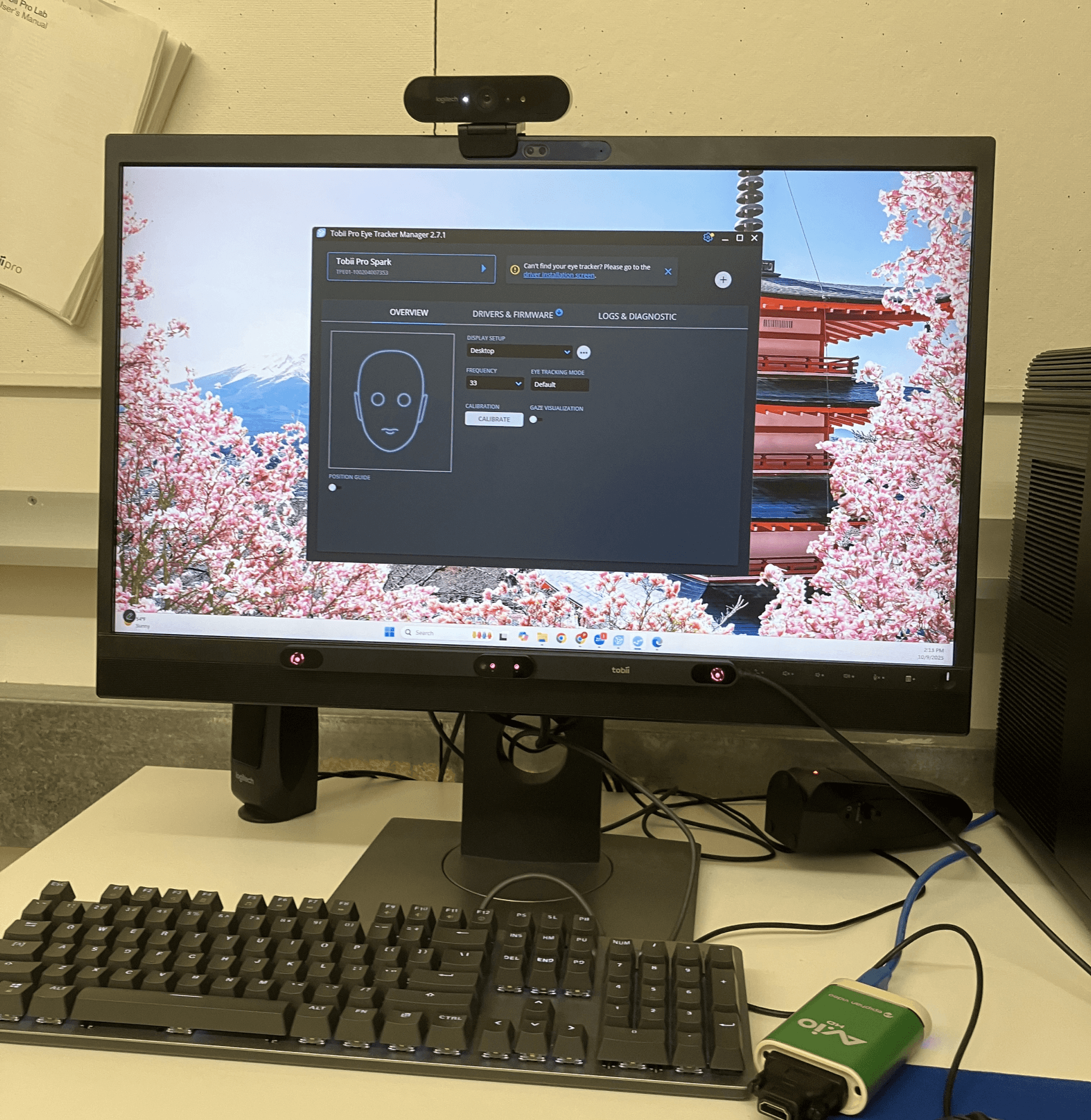
We conducted 8 in-person eye-tracking sessions with first-time users, combining eye tracking with a retrospective think-aloud method in which participants reviewed their session recordings and verbalized their thoughts and decision-making processes.
We conducted 8 in-person eye-tracking sessions with first-time users, combining eye tracking with a retrospective think-aloud method in which participants reviewed their session recordings and verbalized their thoughts and decision-making processes.
Participants completed four tasks that reflect real instructional-design scenarios: creating a course outline, adding content to a module, making a page longer, and adapting the course for different target audience. These tasks helped us observe how first-time users navigate the system.
Participants completed four tasks that reflect real instructional-design scenarios: creating a course outline, adding content to a module, making a page longer, and adapting the course for different target audience. These tasks helped us observe how first-time users navigate the system.
0
0
10
10
20
20
30
30
40
40
50
50
60
60
70
70
80
80
90
90
100
100
Worst imaginable
Worst imaginable
Poor
Poor
OK
OK
Good
Good
Excellent
Excellent
Best imaginable
Best imaginable
Needs serious improvement
Needs serious improvement
Needs improvement
Needs improvement
Good
Good
Excellent
Excellent
61.3
61.3
Acceptability scale
Acceptability scale
System Usability Score
System Usability Score
System Usability Scale (SUS)
System Usability Scale (SUS)
After each session, we asked participants to complete the System Usability Scale (SUS) questionnaire. SUS is a standardized instrument used to evaluate users’ perceived usability of a system. It produces a score ranging from 0 to 100, with higher scores indicating better usability. The course builder received a SUS score of 61.3, which suggests that its usability still needs improvement.
After each session, we asked participants to complete the System Usability Scale (SUS) questionnaire. SUS is a standardized instrument used to evaluate users’ perceived usability of a system. It produces a score ranging from 0 to 100, with higher scores indicating better usability. The course builder received a SUS score of 61.3, which suggests that its usability still needs improvement.
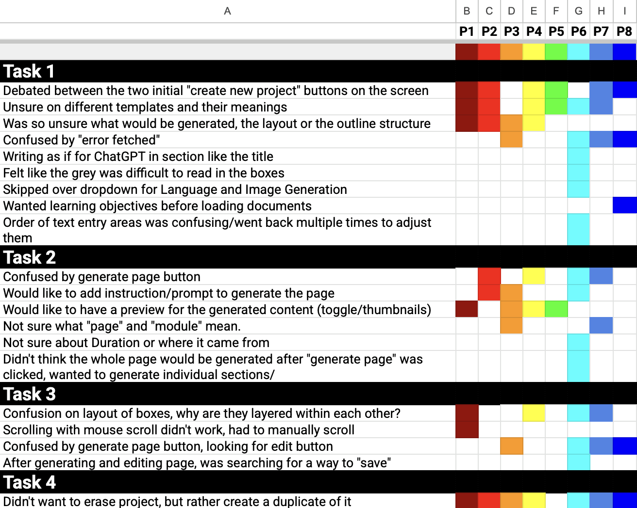
Rainbow Sheet
Rainbow Sheet
After the test sessions, we used a rainbow chart to visualize findings such as user success or failure, sentiment, and pain points. This helped us speed up analysis and reporting.
After the test sessions, we used a rainbow chart to visualize findings such as user success or failure, sentiment, and pain points. This helped us speed up analysis and reporting.
Hotjar
Hotjar
While eye-tracking captured objective visual attention, Hotjar revealed interaction patterns. This gave the GT team clear evidence of where and why the interface was failing.
While eye-tracking captured objective visual attention, Hotjar revealed interaction patterns. This gave the GT team clear evidence of where and why the interface was failing.
hotjar.com
hotjar.com

Finding Summary
Users experience feelings of uncertainty because the system does not guide each step, has unclear labeling, and there is not enough feedback, which decreases confidence and increases cognitive load.
Users experience feelings of uncertainty because the system does not guide each step, has unclear labeling, and there is not enough feedback, which decreases confidence and increases cognitive load.
Theme 1
Theme 1
Lack of Guidance
Lack of Guidance
Finding #1
Finding #1
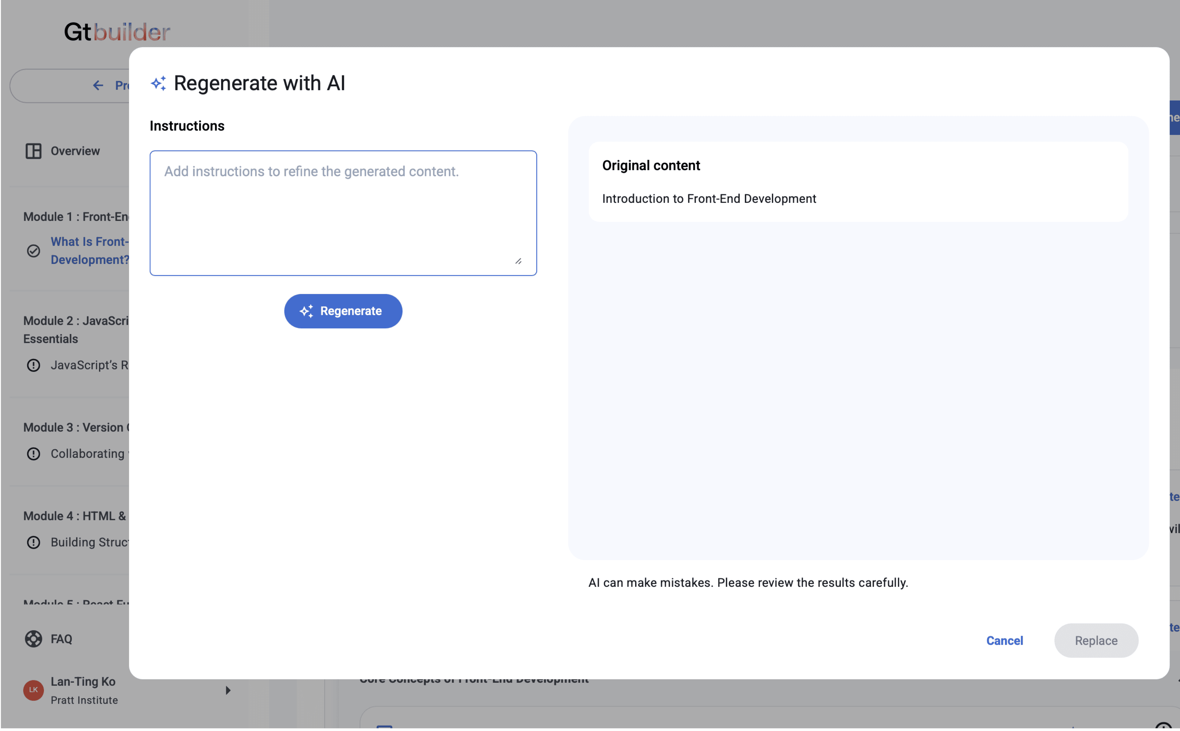
Confusion Between Description and Learning Objectives Fields
Confusion Between Description and Learning Objectives Fields

Participants struggled to tell the difference between the ‘Description’ and ‘Learning Objectives’ fields. In the gaze replay, we saw users copying text back and forth because they weren’t sure what each field was asking for, which made them pause and slowed down their progress.
Participants struggled to tell the difference between the ‘Description’ and ‘Learning Objectives’ fields. In the gaze replay, we saw users copying text back and forth because they weren’t sure what each field was asking for, which made them pause and slowed down their progress.
“I assumed that was going to be in the description… and that’s why I went back and started tearing it apart, because I didn’t realize that shouldn’t be in the description.” - Participant 8
“I assumed that was going to be in the description… and that’s why I went back and started tearing it apart, because I didn’t realize that shouldn’t be in the description.”
- Participant 8
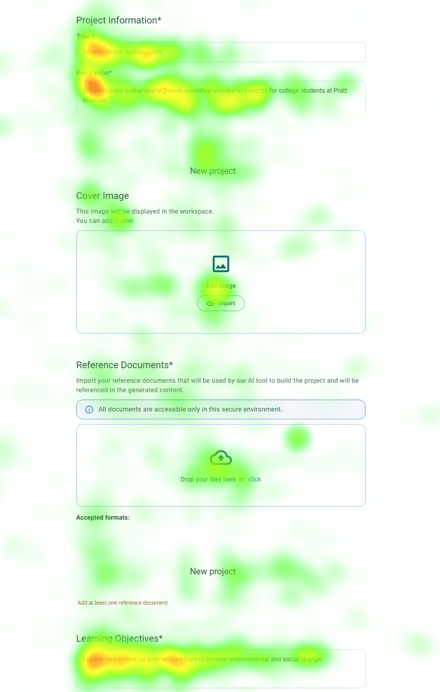
Low Fixation
Low Fixation
High Fixation
High Fixation
The heatmap shows heavy fixation on the “Description” and “Learning Objective” fields, indicating that participants spent additional time trying to figure out what content belonged in each one.
The heatmap shows heavy fixation on the “Description” and “Learning Objective” fields, indicating that participants spent additional time trying to figure out what content belonged in each one.
Solution #1
Solution #1
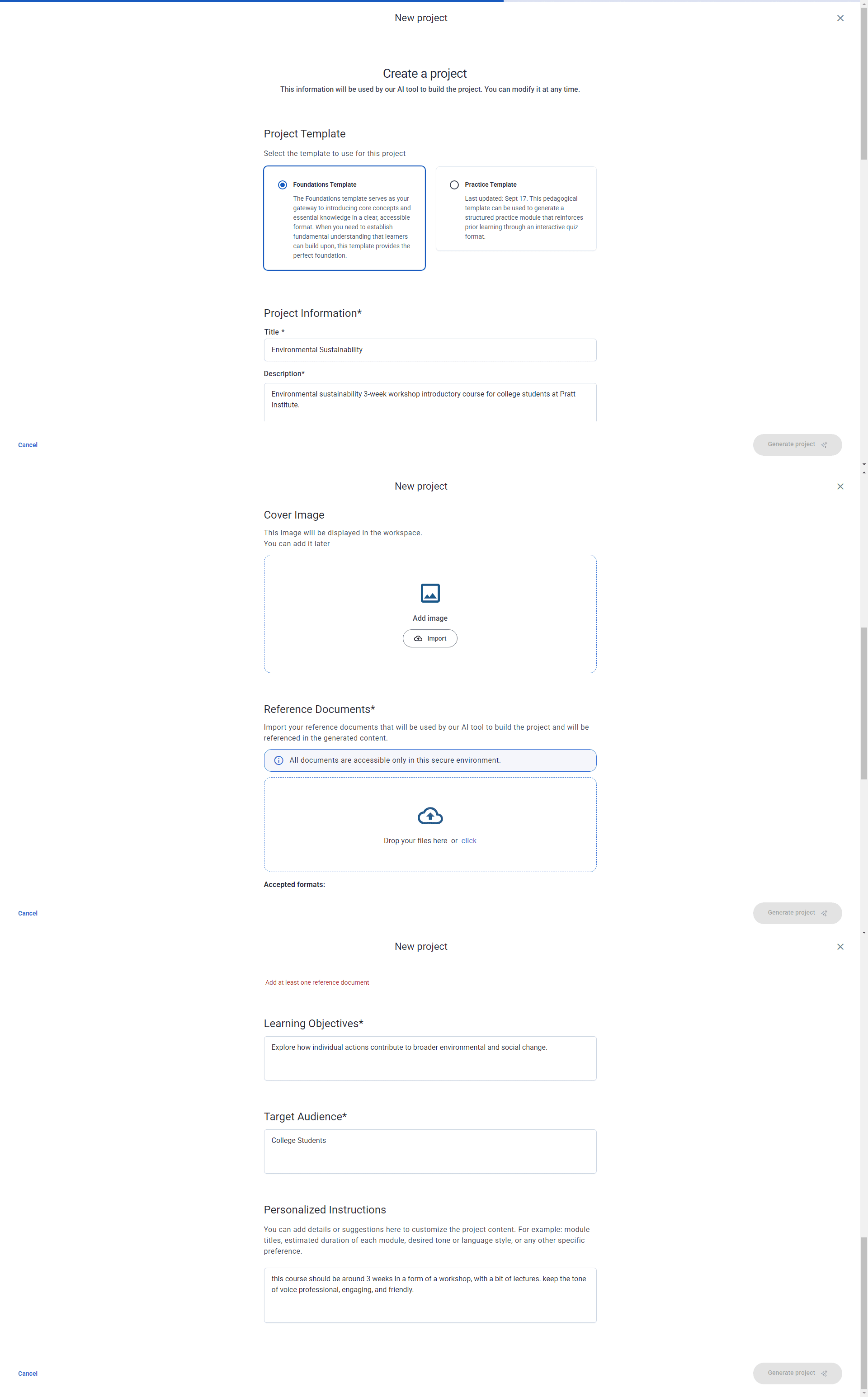
Provide 4 Key Information Types Users Need
Provide 4 Key Information Types Users Need
gt-builder.com
gt-builder.com
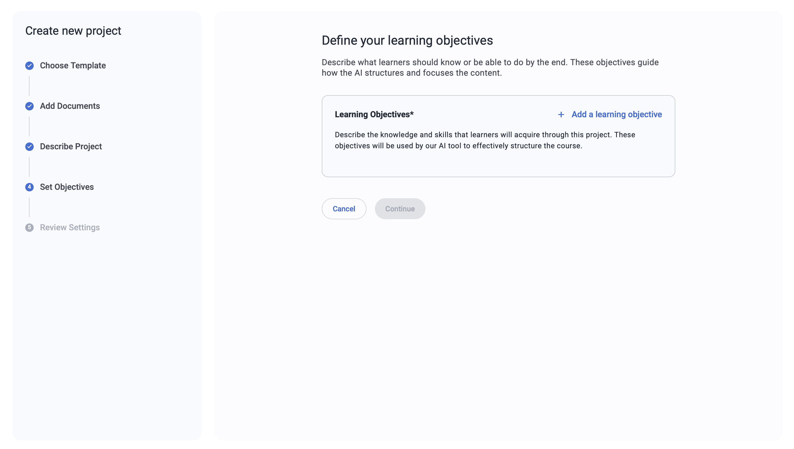
Learning Objectives*(required)
Learning Objectives*(required)
Choose or add 3–5 learning objectives
Choose or add 3–5 learning objectives
Understand the concept of sustainability
Understand the concept of sustainability
Identify core principles and terminology.
Identify core principles and terminology.
Complete a small project
Complete a small project
Apply the methods learned
Apply the methods learned
Add a learning objective
Add a learning objective
Cancel
Cancel
Continue
Continue
Describe the knowledge and skills that learners will acquire through this project.
Describe the knowledge and skills that learners will acquire through this project.
1
1
2
2
3
3
4
4
These objectives will be used by our AI tool to effectively structure the course.
These objectives will be used by our AI tool to effectively structure the course.
We recommend adding four types of information that users need while filling out the form. This will help them better understand each field and reduce cognitive load.
We recommend adding four types of information that users need while filling out the form. This will help them better understand each field and reduce cognitive load.
1
Indicate Purpose
Indicate Purpose
What are they filling out right now?
What are they filling out right now?
3
Content Guidance
Content Guidance
What kind of information should they put here?
What kind of information should they put here?
2
Length Guidance
Length Guidance
How much should they write?
How much should they write?
4
AI Transparency
AI Transparency
How will this affect the generated course?
How will this affect the generated course?
Theme 2
Theme 2
Unclear Labeling
Unclear Labeling
Finding #2
Finding #2
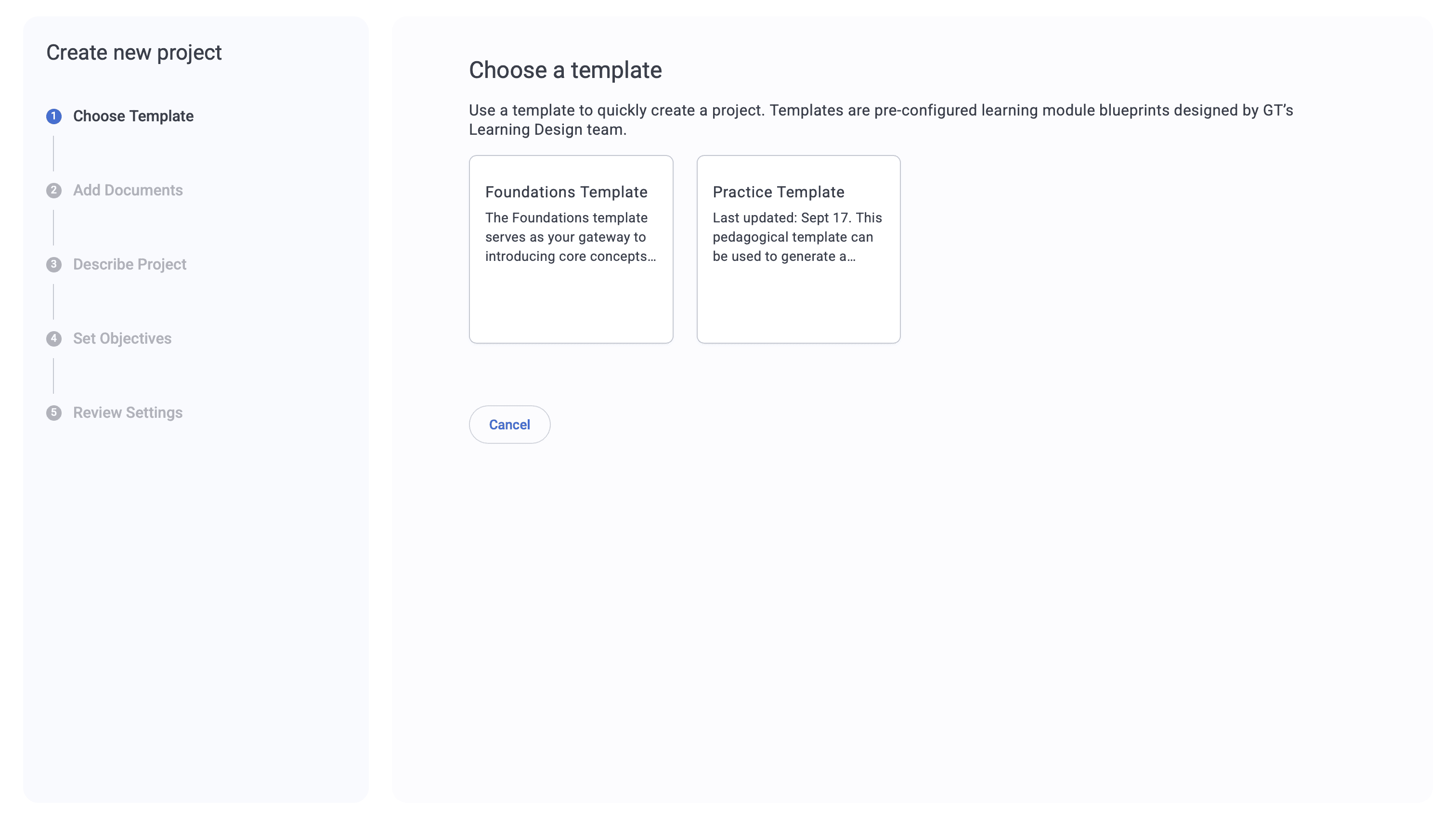
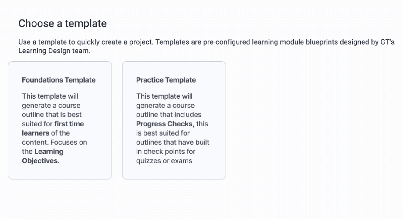
Confusion Around Template Types and Their Meaning
Confusion Around Template Types and Their Meaning
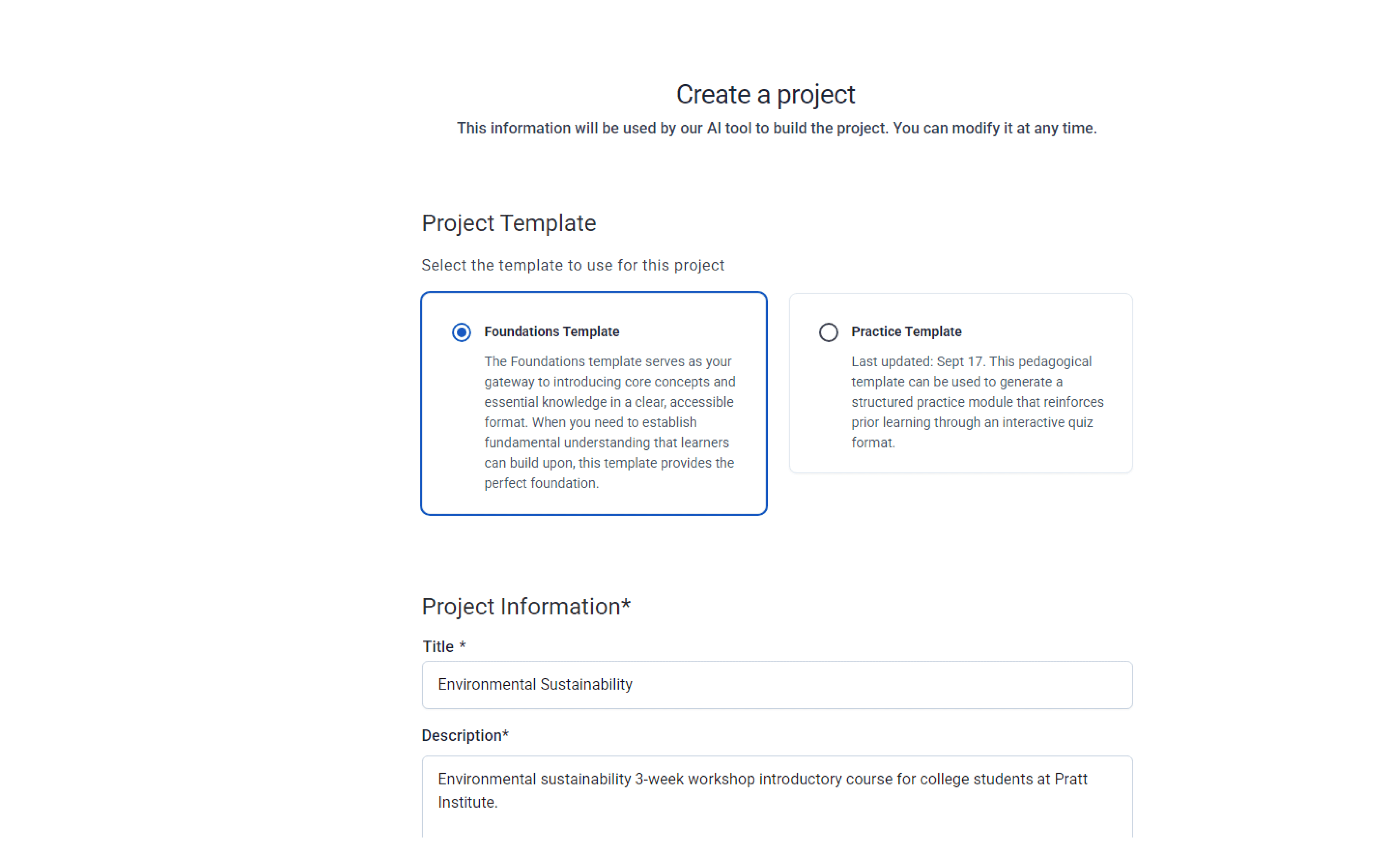
6/8 participants said they weren’t sure what the difference was between the foundation and practice templates. Because they didn’t understand how each option would affect the course, most people guessed and chose the one that felt “safer,” which made them uncertain about whether they had made the right decision.
6/8 participants said they weren’t sure what the difference was between the foundation and practice templates. Because they didn’t understand how each option would affect the course, most people guessed and chose the one that felt “safer,” which made them uncertain about whether they had made the right decision.
“Based on the task, I felt [the target audience] already knew foundations enough, and the practice felt more advanced… so I chose that” - Participant 1
“Based on the task, I felt [the target audience] already knew foundations enough, and the practice felt more advanced… so I chose that” - Participant 1
We recommend adding clearer guidance—such as example projects and expected outcomes—and highlighting key ideas to help users understand how to use these two templates.
We recommend adding clearer guidance—such as example projects and expected outcomes—and highlighting key ideas to help users understand how to use these two templates.
Solution #2
Solution #2
Indicate the outcome in the description
Indicate the outcome in the description
Theme 3
Theme 3
Lack of Feedback
Lack of Feedback


Finding #3
Finding #3
Uncertainty Around Saved Work
Uncertainty Around Saved Work
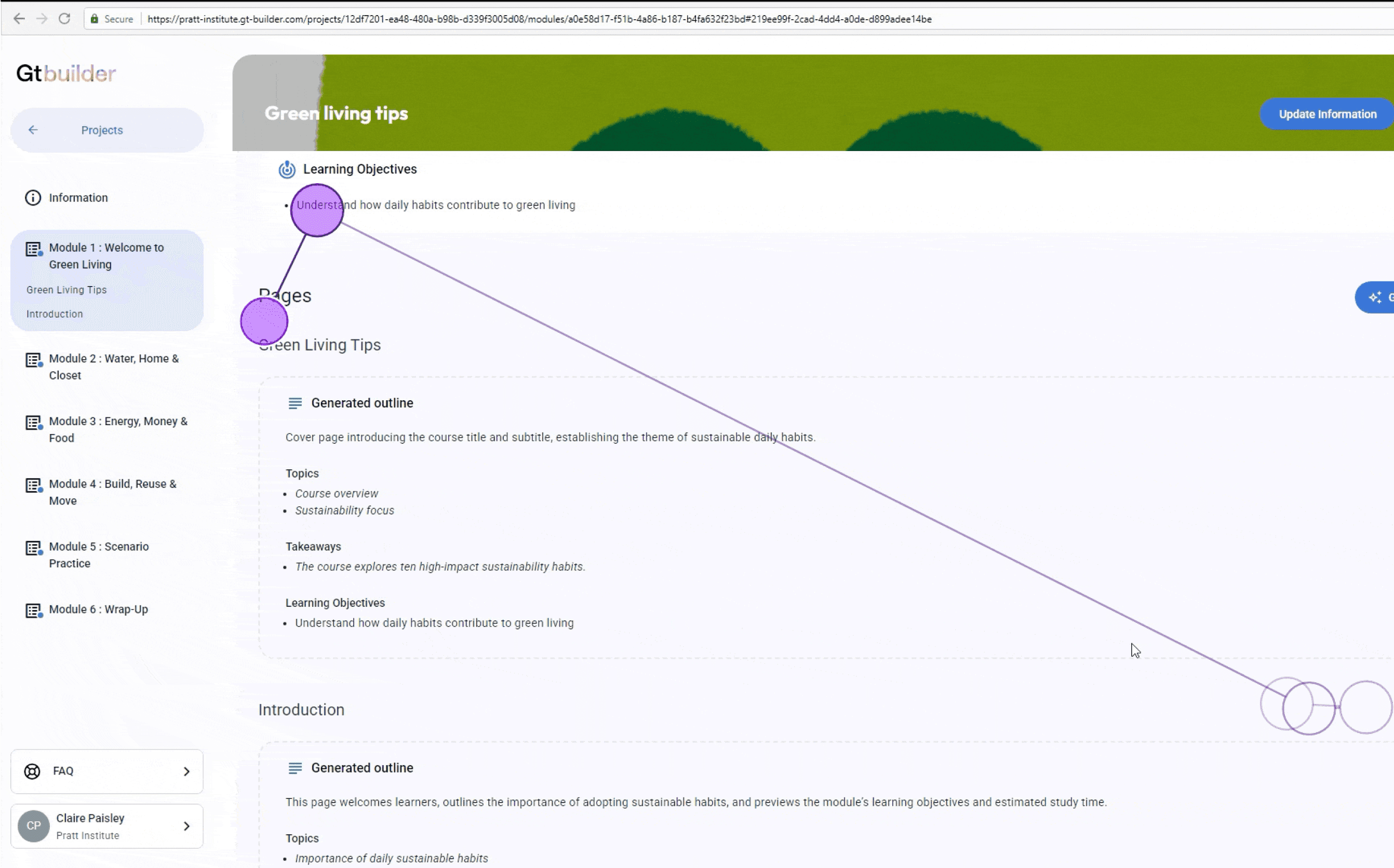
After generating pages of content, 4/8 participants were confused by the wording of the “Update Information” button. They weren’t sure if their work was saved, which made them hesitate and lowered their confidence in the system.
After generating pages of content, 4/8 participants were confused by the wording of the “Update Information” button. They weren’t sure if their work was saved, which made them hesitate and lowered their confidence in the system.
Tobii
Tobii
Hotjar
Hotjar
“I wasn’t sure if the work I had just done was being saved or not… the wording was confusing to me. I was looking for some sort of save update” - Participant 6
“I wasn’t sure if the work I had just done was being saved or not… the wording was confusing to me. I was looking for some sort of save update” - Participant 6
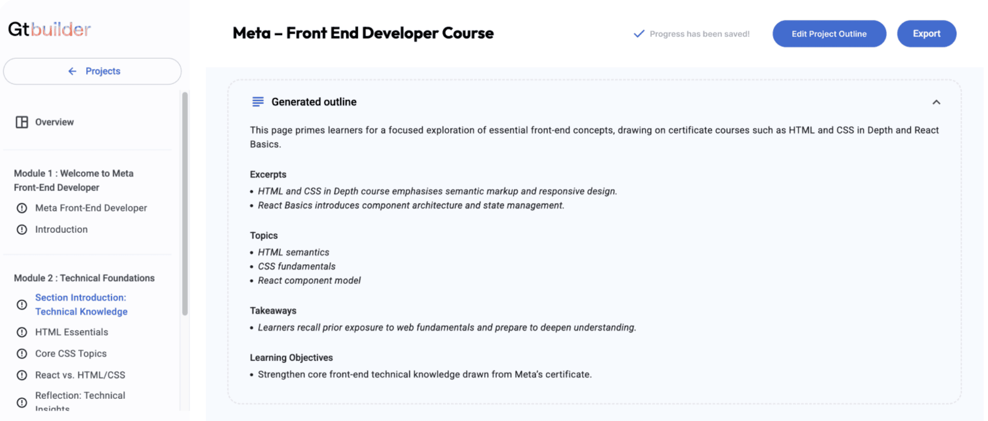
Solution #3
Solution #3
Add in a saved indicator and clarify updating button
Add in a saved indicator and clarify updating button
Update the button label to “Edit Project Outline” to clearly signal that users are entering an editable state. Also, add an indicator that the project has been saved. This will help users feel more confident that their work is preserved.
Update the button label to “Edit Project Outline” to clearly signal that users are entering an editable state. Also, add an indicator that the project has been saved. This will help users feel more confident that their work is preserved.
Next Step
Next round of usability testing
Next round of usability testing
Validate whether the updated version successfully reduces confusion and improves the user flow by testing it again with first-time users. This will help confirm whether the changes actually solve the issues we found and whether users can move through the workflow with fewer pauses and more confidence.
Validate whether the updated version successfully reduces confusion and improves the user flow by testing it again with first-time users. This will help confirm whether the changes actually solve the issues we found and whether users can move through the workflow with fewer pauses and more confidence.
Add onboarding guidance
Add onboarding guidance
In our other findings, we also noticed that many smaller issues could be reduced with clearer onboarding guidance. A brief walkthrough or contextual hints would help first-time users understand how the system works and prevent much of the early confusion.
In our other findings, we also noticed that many smaller issues could be reduced with clearer onboarding guidance. A brief walkthrough or contextual hints would help first-time users understand how the system works and prevent much of the early confusion.
Conclusion
How the Findings Created Impact
How the Findings Created Impact
Fixing these issues will help first-time users move through the Course Builder AI with more clarity and confidence. I shared the findings with the GT team through a slide report and a walkthrough presentation of key eye-tracking insights and recommendations. This helped the team clearly see where users struggled and understand the evidence behind each insight. The study also demonstrated how triangulating data can reveal small design issues that create uncertainty, and how addressing them can lead to a smoother, more intuitive workflow.
Fixing these issues will help first-time users move through the Course Builder AI with more clarity and confidence. I shared the findings with the GT team through a slide report and a walkthrough presentation of key eye-tracking insights and recommendations. This helped the team clearly see where users struggled and understand the evidence behind each insight. The study also demonstrated how triangulating data can reveal small design issues that create uncertainty, and how addressing them can lead to a smoother, more intuitive workflow.
Impact
“We were taking notes the whole time. This was really helpful.”- GT Course Builder AI Product Manager
“We were taking notes the whole time. This was really helpful.”- GT Course Builder AI Product Manager
Takeaway
Data Triangulation Leads to Stronger Insights
Data Triangulation Leads to Stronger Insights
Triangulating multiple data sources required significant effort, but it allowed me to build objective evidence for each finding. In the end, integrating different types of data led to far stronger and more reliable insights about the user experience.
Triangulating multiple data sources required significant effort, but it allowed me to build objective evidence for each finding. In the end, integrating different types of data led to far stronger and more reliable insights about the user experience.